Between the lines
A bold design for a different kind of branding publication
Brand language studio Opening Line wanted their first publication to make a strong visual impact in order to draw the creative industry’s attention to the topic. From early creative concepts to sourcing the perfect print partner, we collaborated with them to design a distinctive identity for the publication and its launch.
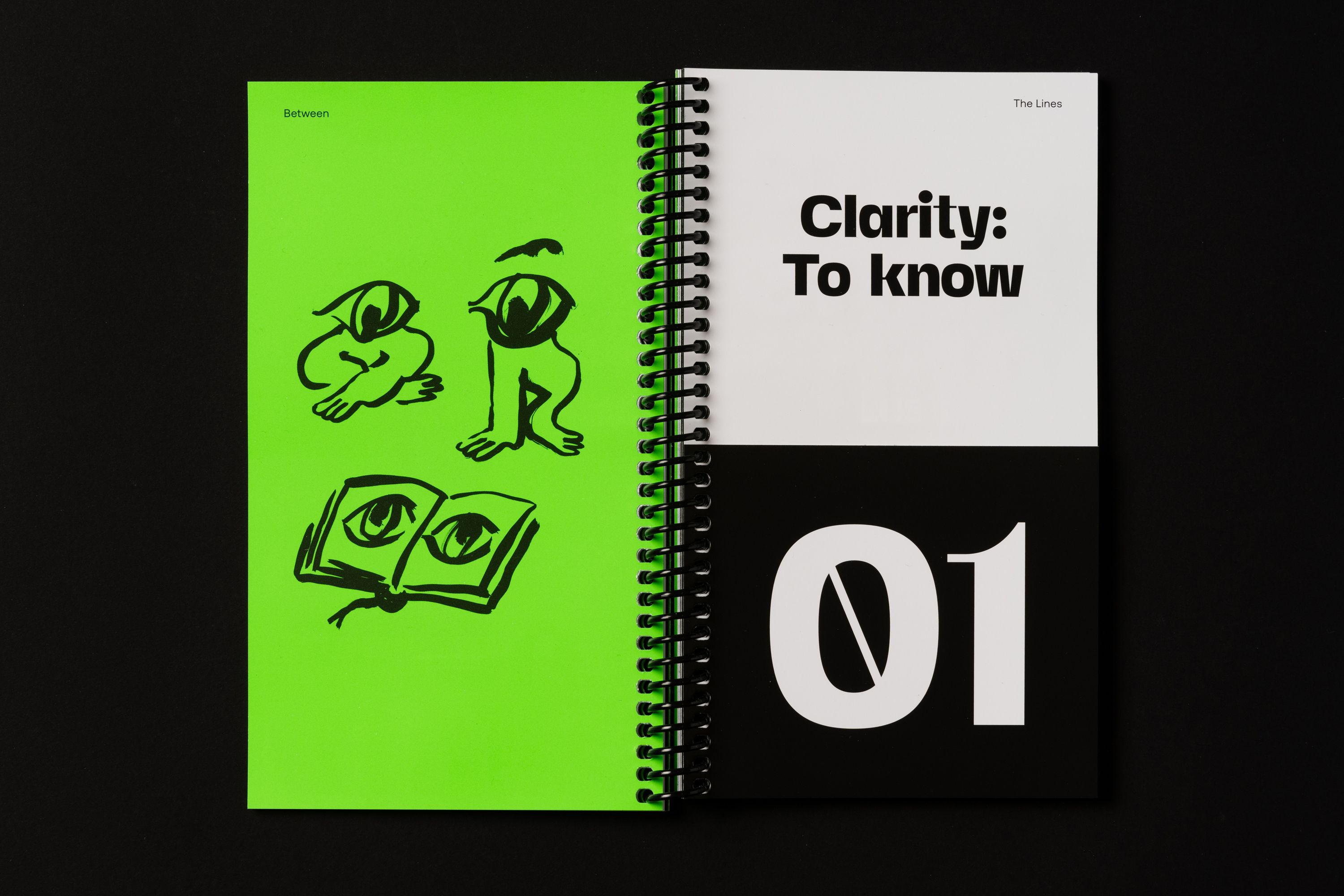
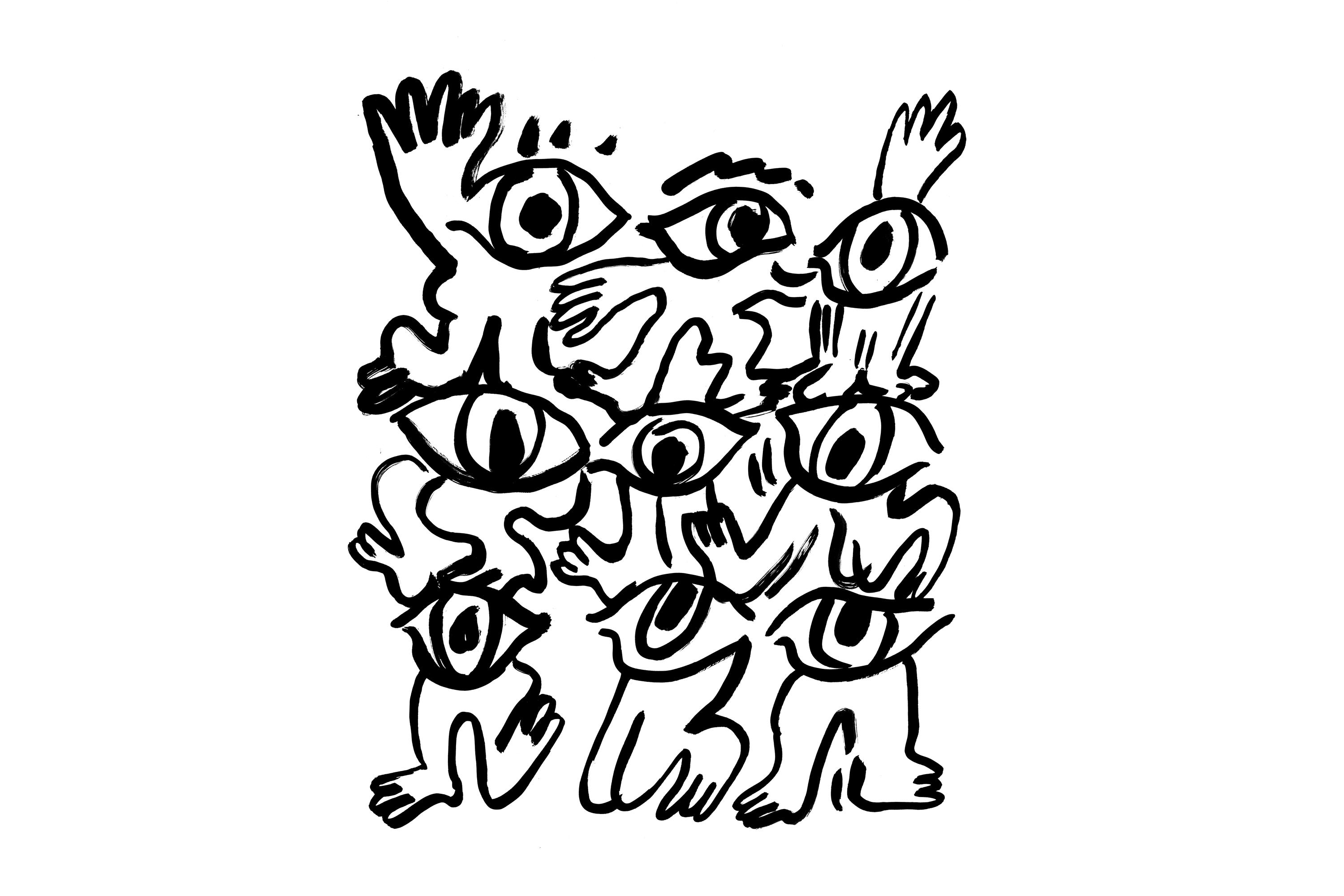
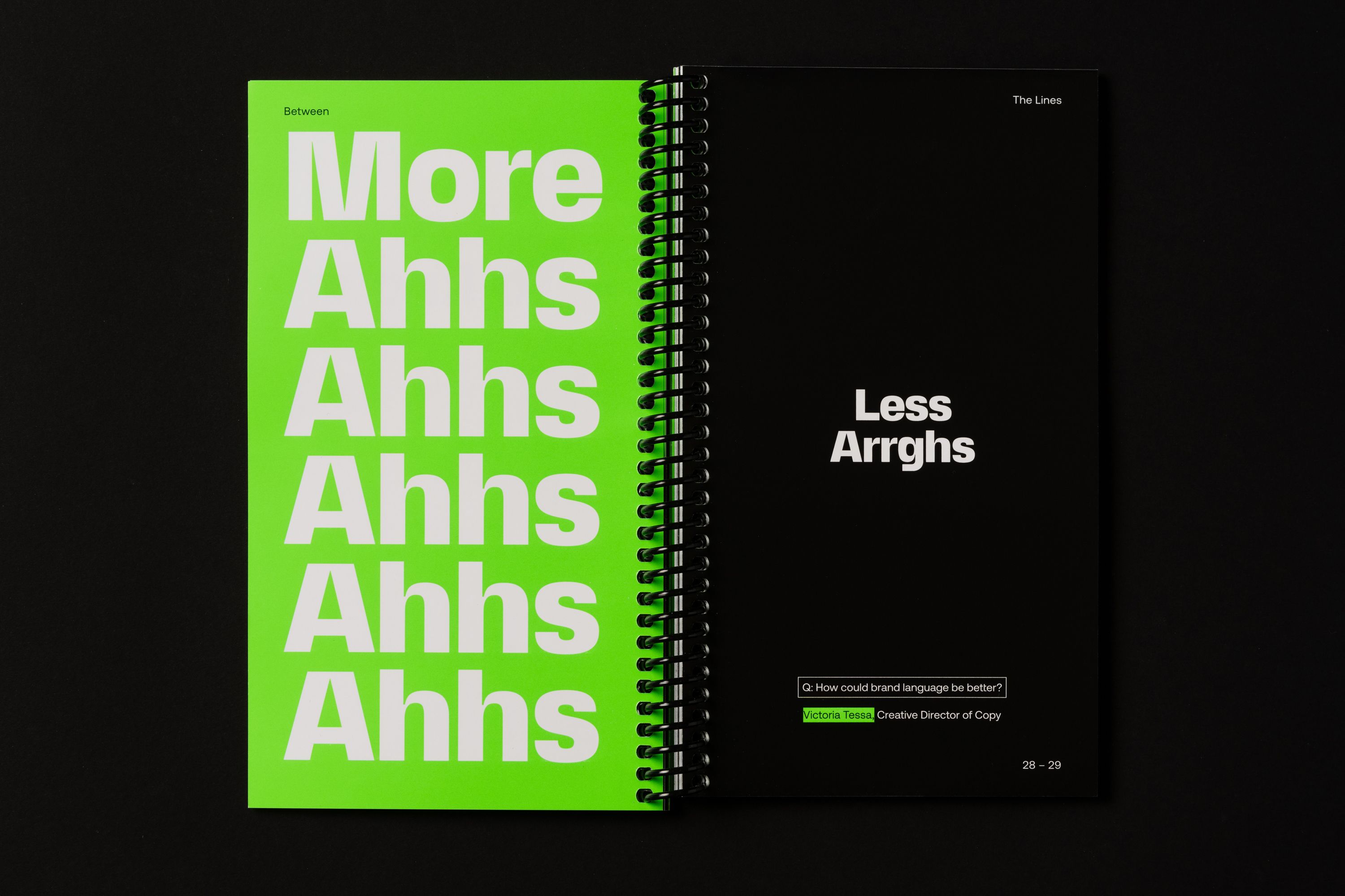
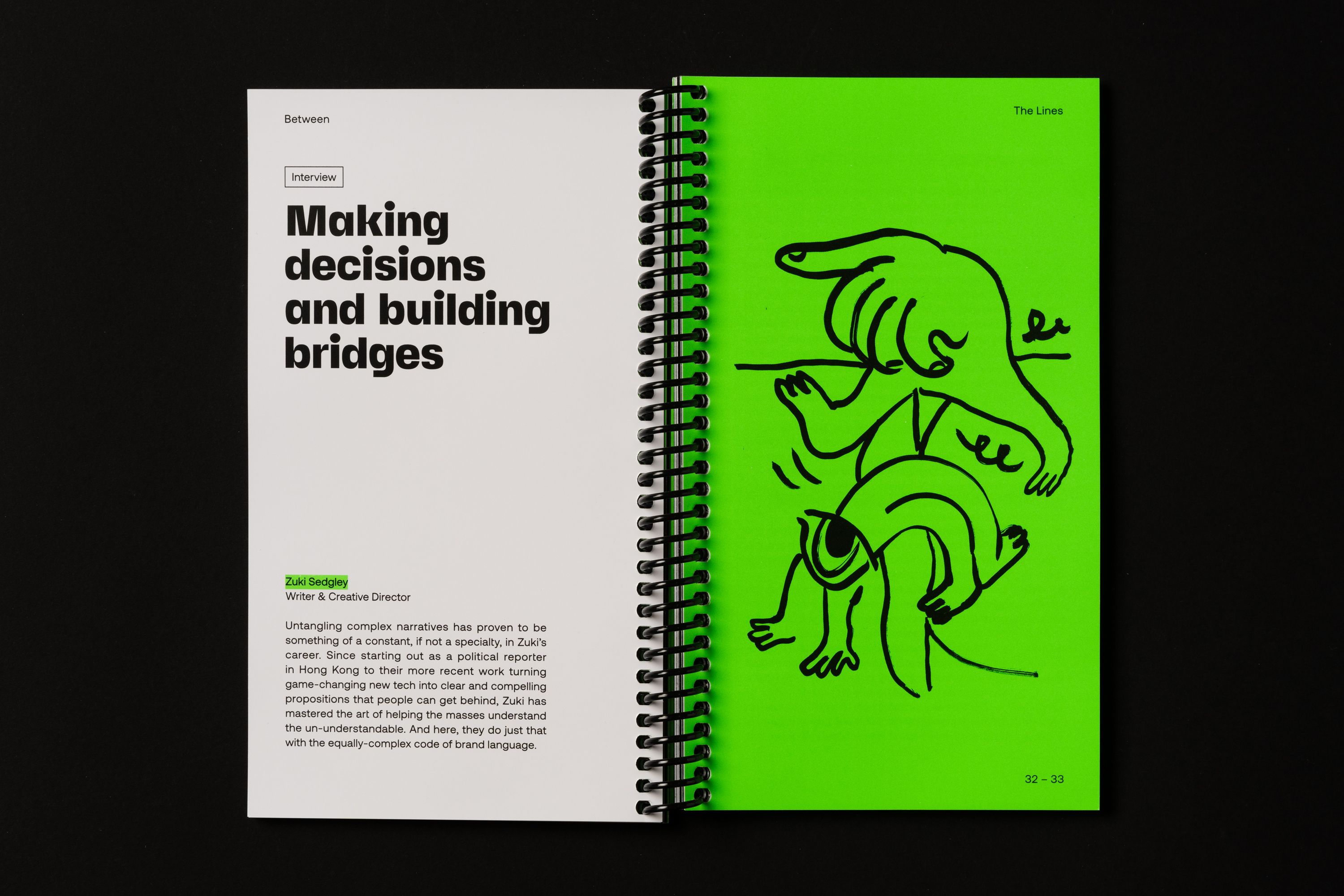
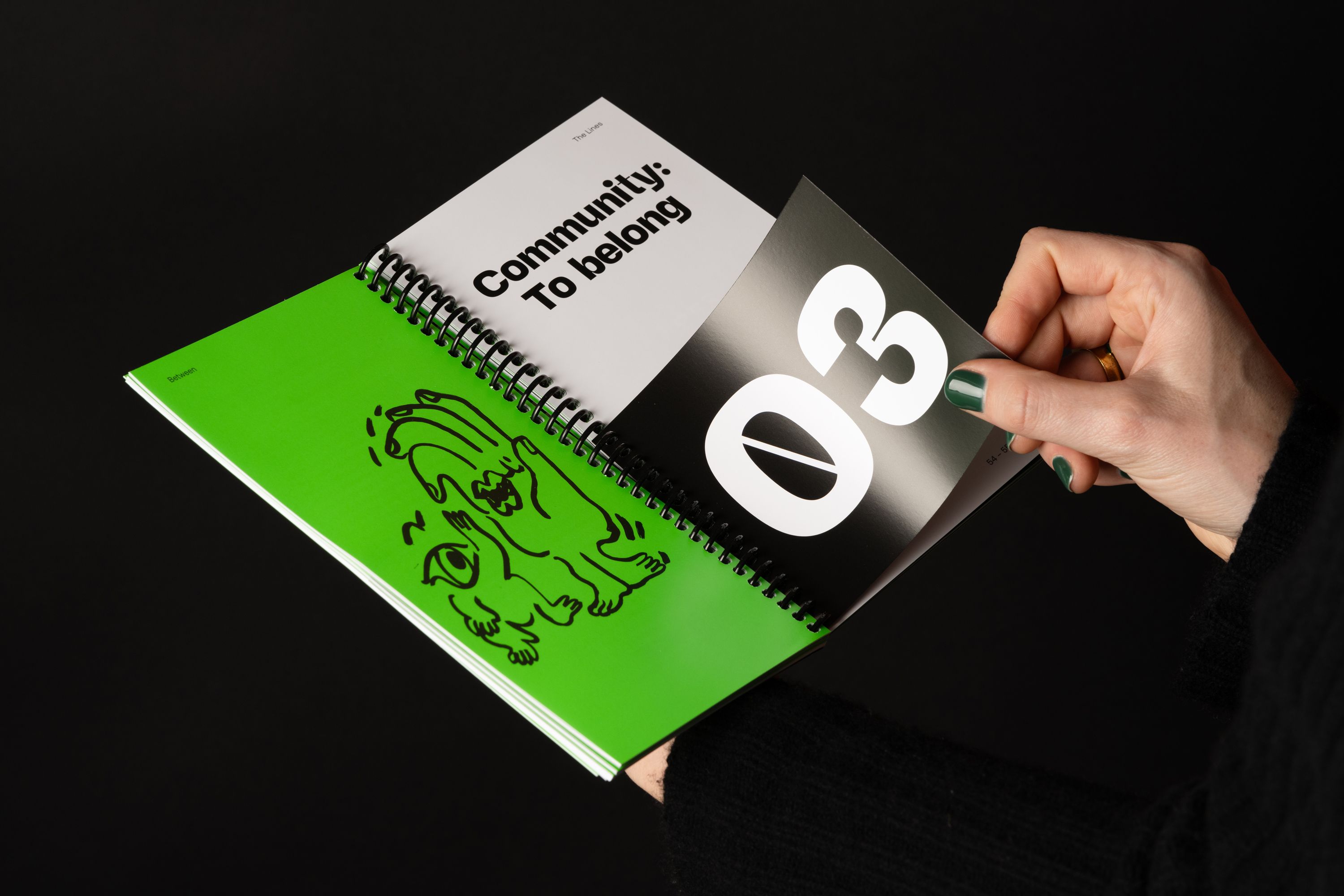
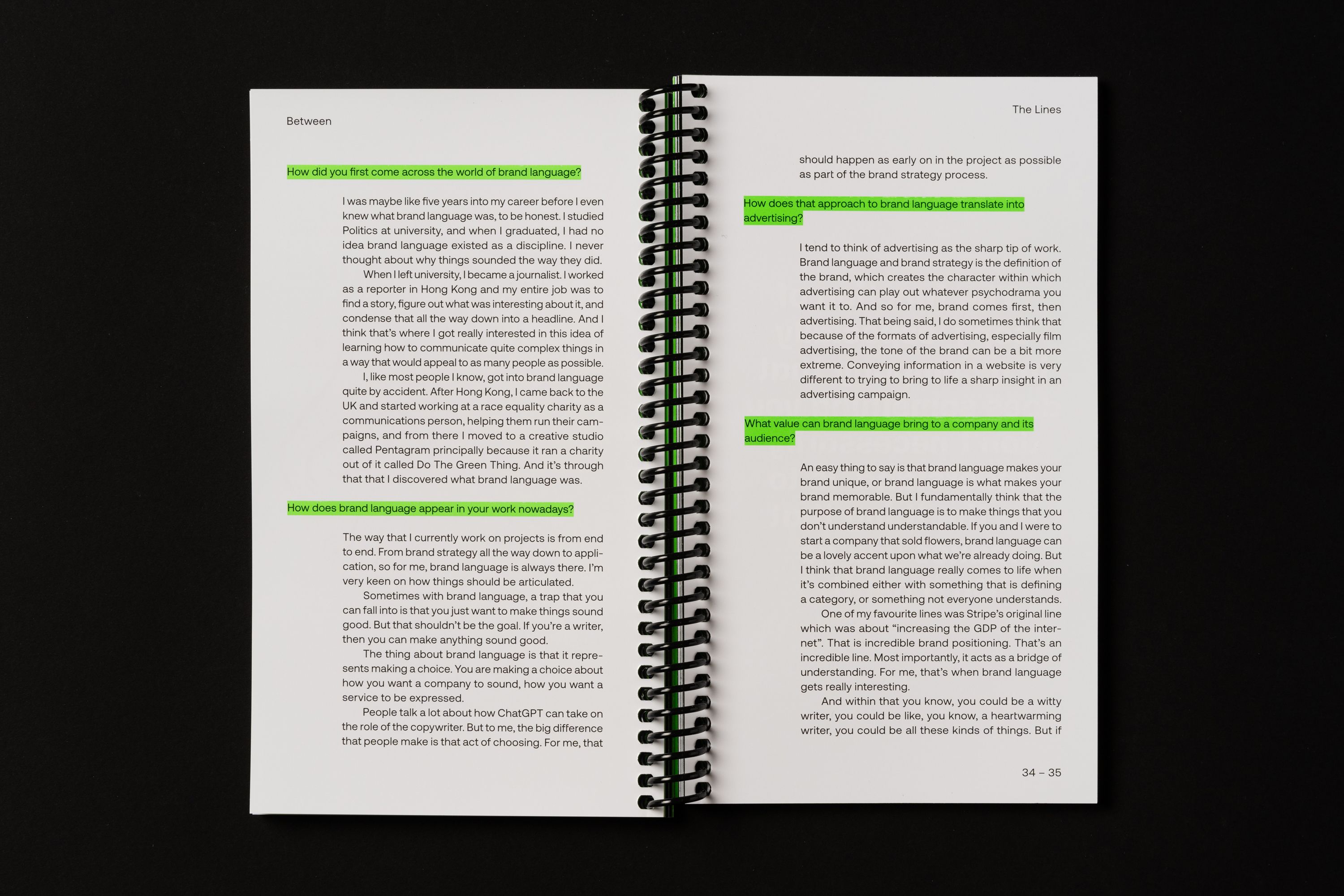
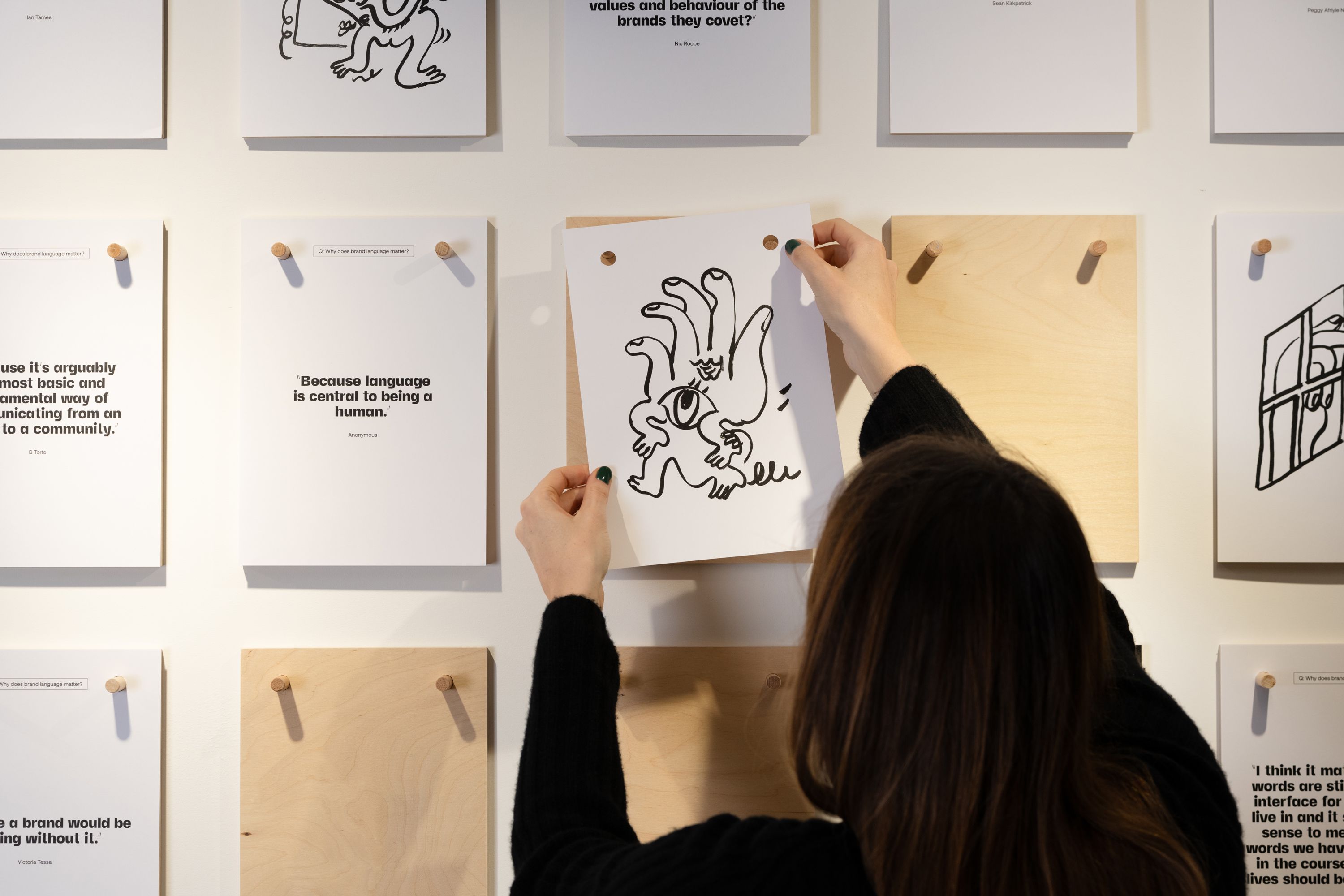
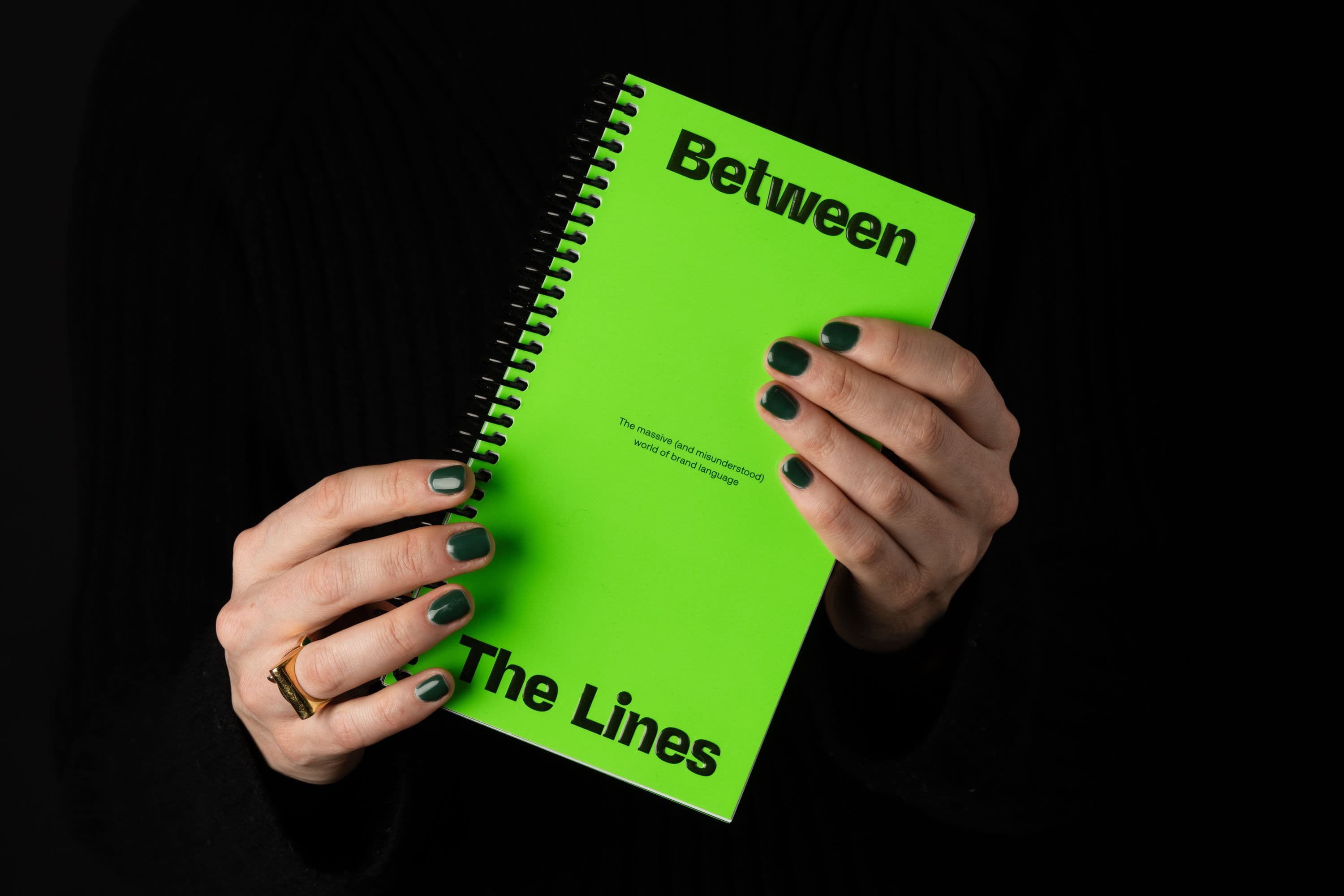
On the cover, a bright green high gloss sheen meets a bold typographic palette. Inside, we commissioned illustrator Olga Prader to bring the publication’s themes to life with her signature wit and playfulness. Spiral binding, tip-in sheets and a pocket-sized format all add up to a highly tactile experience, inviting the reader to engage with the text in a meaningful way.
Photography credit: Tian Khee Siong
Disciplines
- Editorial
Sector
- Brand language
- Publishing